From Research to Design
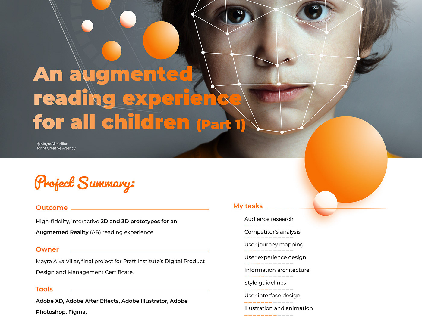
In the first part of this case study, I explained how my initial idea—to use augmented reality to make storybooks more engaging—transformed into a more ambitious goal: designing a reading experience for all children, while addressing the unique challenges faced by children with autism.
To achieve this, I conducted extensive research. I studied competing AR storybook products and quickly realized that most of them shared the same weaknesses: overwhelming visual and auditory environments, a lack of customization options, and insufficient guidance for users. These products did not take into account children with learning disorders or sensory sensitivities, often resulting in cognitive overload.
From interviews with teachers and parents, I gained valuable insights into assistive technology and augmentative communication tools. These conversations reinforced the importance of clear instructions, visual prompts to elicit responses, and opportunities for customization. They also highlighted the need for products that allow all children—not only those with autism—to express themselves in ways that feel natural.
After research -> Feature identification
User Stories and Hypotheses
Based on this research, I refined my user stories and hypotheses.
Parents and teachers would use this digital product to help children strengthen communication skills, while having the ability to adjust product settings according to the child’s needs.
Children would interact with storybook characters using visual prompts (such as emoticons) to express emotions, offering both a playful interaction and a supportive communication tool.
This inclusive design approach confirmed my guiding principle: designing for the edges benefits everyone.
Ideation and Prototyping
The design journey began with numerous sketches and Crazy 8s sessions to brainstorm ideas. One of the most complex challenges was translating concepts from 2D to AR/3D environments. Interfaces that looked functional in flat prototypes often failed when tested in 3D. To address this, I created wireframes to map the user journey and iterated through multiple prototypes, each one tested in an AR environment to validate the user experience.
Through these iterations, I discovered the importance of touch gestures for navigation and interaction. These gestures made the product more intuitive for children, supporting natural engagement instead of adding more layers of complexity.
The Design System
I then defined a design system to ensure consistency and accessibility across platforms. It included:
A palette with one primary color and three secondary colors.
Fonts adapted to each operative system.
A set of icons and emoticons designed for clarity and ease of recognition.
The design system aimed for simplicity—enough visual appeal to capture attention but restrained enough to avoid sensory overload.
2D and 3D Prototypes
The 2D prototype demonstrated how children could engage in activities such as selecting an emoticon to interact with a character. For children with autism, this activity served a dual purpose: it provided a fun interaction while also offering a structured way to express emotions, something many struggle to articulate verbally.
The 3D prototype built upon these foundations, incorporating customization controls for sound and brightness. This flexibility allows any child to adjust the environment to their comfort, but for children with autism, such options can make the difference between disengagement and full participation.
Onboarding and microinteractions
Following heuristics AR design principles and accessibiity considerations I did the second and third iterations of the prototype

