Transforming Face-to-Face Training into a Mobile-First Experience
The Challenge
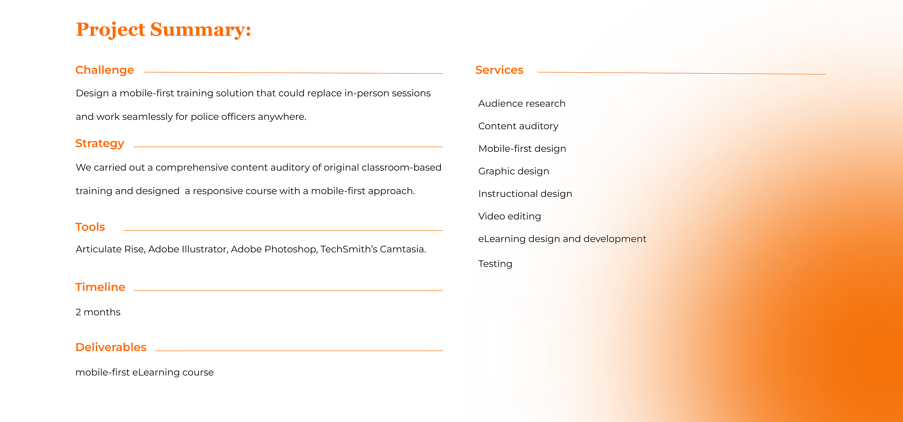
An intergovernmental agency needed to adapt their in-person training sessions into a mobile-friendly online format. The course was targeted at police officers. They would mainly use their phones, and often in areas with poor internet. As an alternative, the trainees could access the course from computers provided by a training center. So, the final solution should work on both phones and computers. The challenge was to transform instructor-led PowerPoint presentations into an engaging and practical mobile learning experience that could meet the unique needs of the target audience.
The Solution
We designed a mobile-first course using Articulate Rise, a responsive, web-based authoring tool that ensures compatibility across all devices. The course was built to deliver essential information directly in the officers’ context of performance. By applying user-centered design principles and focusing on the specific needs of the mobile users, we created an interactive learning experience that was easy to access, understand, and apply in real-world field scenarios.
Our Approach
“We prioritize user needs, performance context, and mobile-first design to create effective learning experiences.”
— Villar, 2013
— Villar, 2013
Mobile-First Mindset & Responsive Design
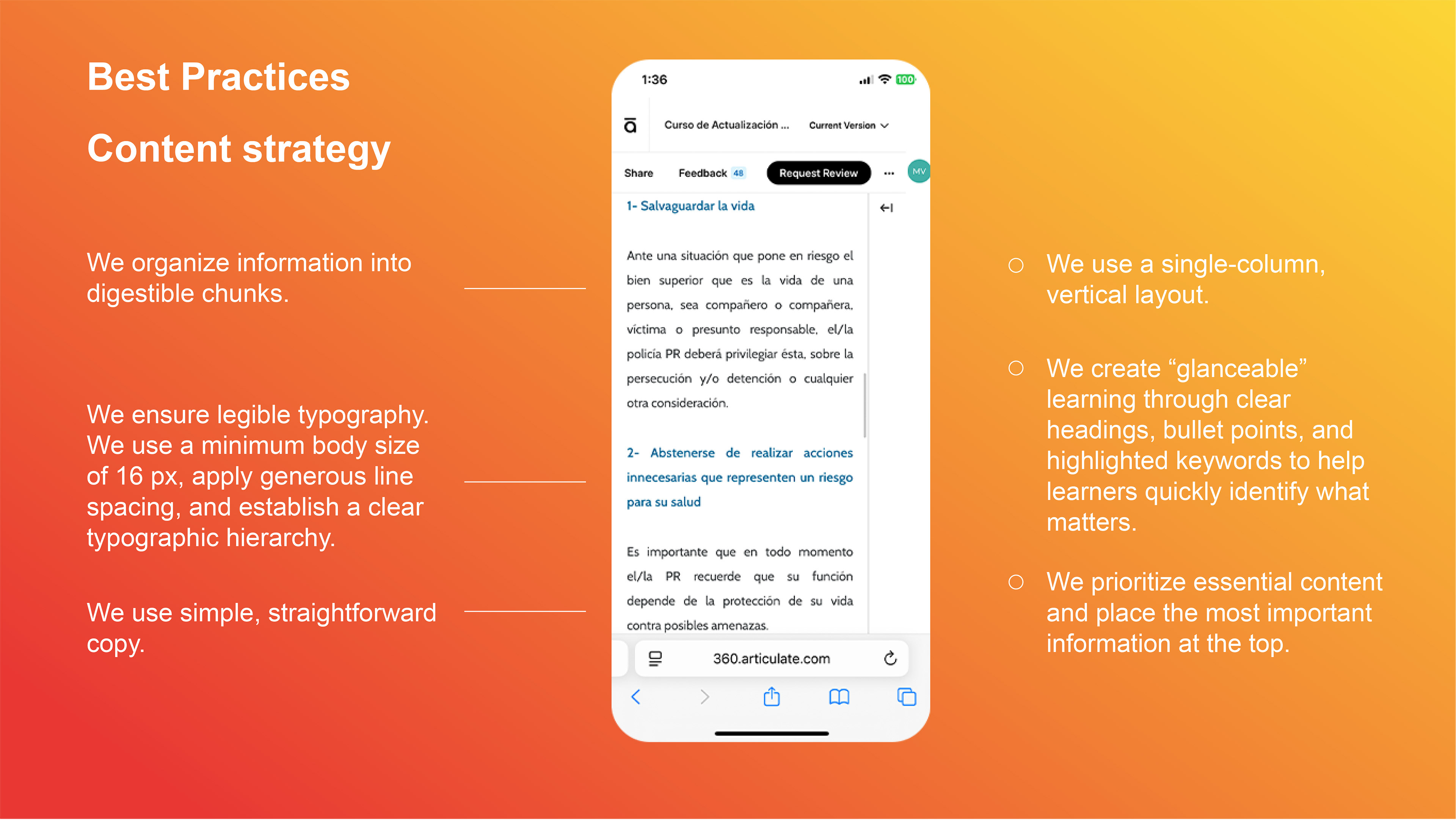
In a mobile-first approach, we design eLearning content starting with the smallest screen in mind—usually a smartphone. We focus on key content, intuitive navigation, and readability from the start, ensuring a seamless experience for mobile users. We begin with a thorough content strategy to identify what’s essential, and then define what is the best way to organize and present that content.
This mindset not only improves accessibility but also strengthens the overall design. By focusing on what matters most, we’re able to optimize content for touch interactions and carefully craft every asset—images, graphics, and media—so they render effectively across different screen sizes.
Responsive design in Articulate Rise ensures that course layouts automatically adapt to any device, with no additional coding or configuration needed. Rise uses a modular, web-based format where text, media, and interactions fluidly rearrange themselves to fit phones, tablets, and desktops. This responsive behavior makes the design inherently portable and accessible, allowing us to tailor learning experiences to each user’s context and environment. In doing so, we achieve what Ethan Marcotte describes as “a high level of continuity between different contexts” (2011:107).
We begin with a thorough content strategy to identify what’s essential, and how to present the content.
Text, media, and interactions fluidly rearrange themselves to fit phones, tablets, and desktops.
Our Process
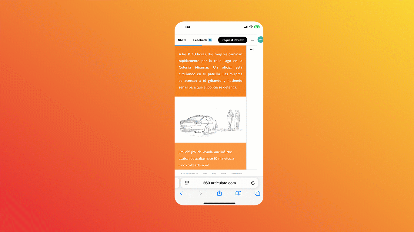
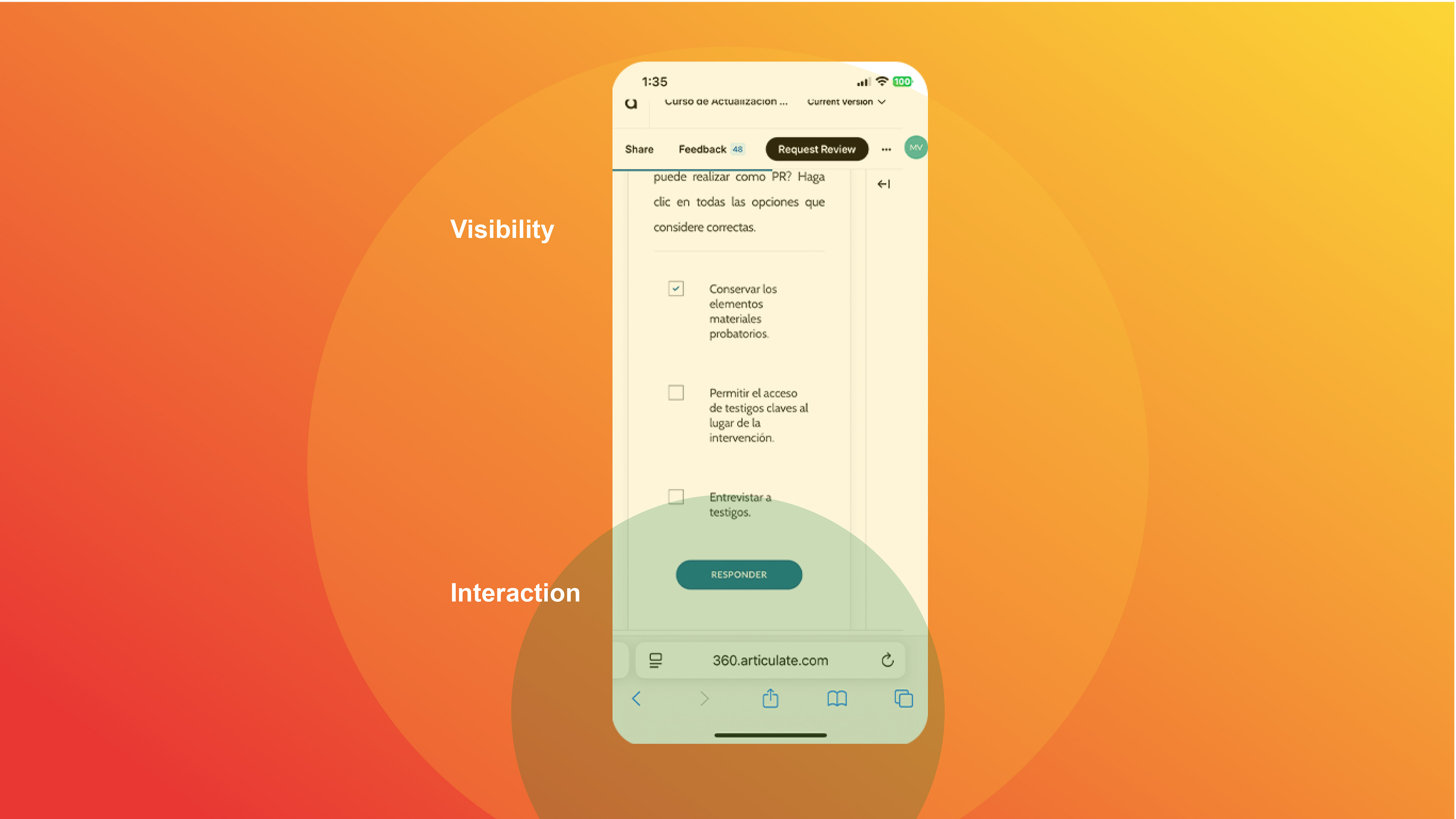
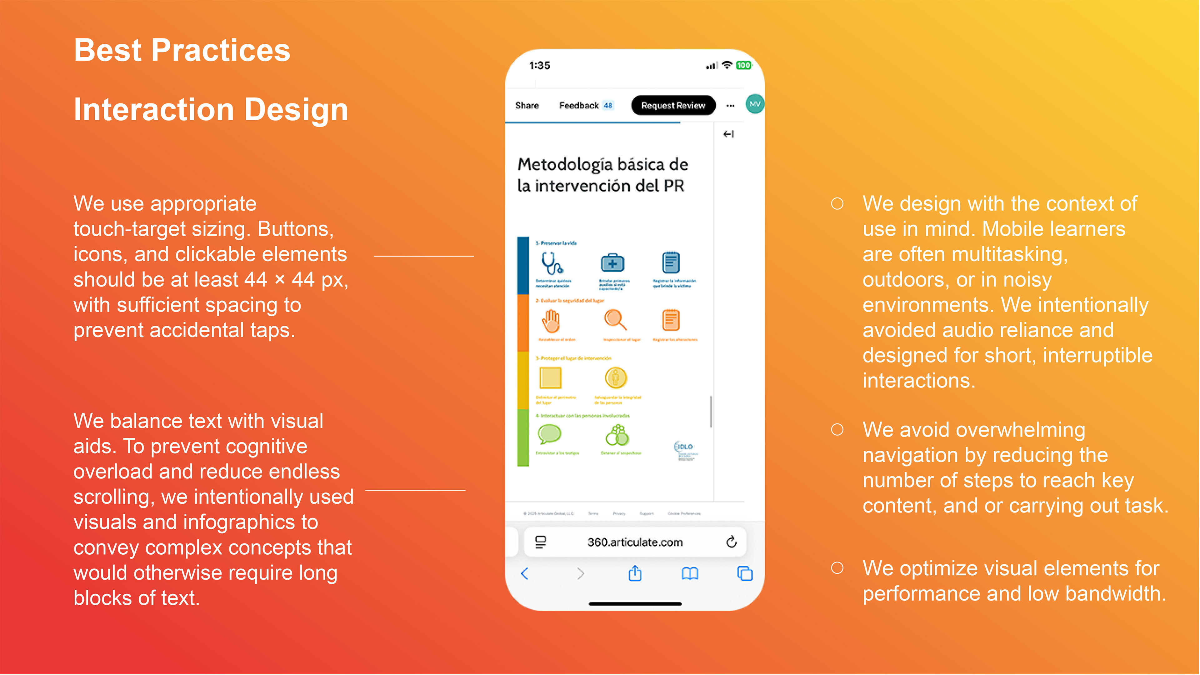
1. Understanding the Learners and their Context: The end users were police officers working outdoors, in noisy, unpredictable environments. Given these constraints, we found that audio-based solutions were not viable, and also, connectivity could be unreliable. We focused the solution on text and images that were concise and visually engaging on-screen.
2. Conducting a Content Inventory: We reviewed all existing training materials, cataloging, evaluating, and reformatting content for a mobile-first design. Key steps included:
• Identifying legacy content to keep, edit, or discard.
• Filling content gaps to ensure completeness and relevance.
• Restructuring information into small, digestible chunks optimized for mobile delivery.
3. Designing the Mobile Learning Experience: The course focused on the mobile user experience, ensuring accessibility and usability across devices. Features included:
• Task-relevant content: Focused on what learners needed to know in specific scenarios.
• Interactive elements: Designed for touch gestures to enhance engagement and usability.
• Seamless integration with workflows: Enabled learners to access key information quickly without interrupting their tasks.
4. Iterative Development and Testing: I gathered feedback from stakeholders and users during design. This way, I made sure the course met both organizational and learner needs.
Results
The final product was a mobile-optimized course that:
• Delivered relevant, concise information tailored to the learners' context of performance.
• Enhanced user engagement with intuitive interactions and a clean interface.
• Provided a reliable and intuitive experience for learners.
This solution empowered first responders to access critical training materials anytime, anywhere, enabling them to perform their duties effectively even under challenging conditions.
Key Takeaway
Mobile learning thrives on immersion, contextual application, and immediate accessibility. Focusing on user needs —and designing with a mobile-first mindset— helps organizations create effective learning experiences that meet learners at their moment of need.
Discover how tailored mobile learning solutions can enhance your team's performance in critical situations.
Let's create something impactful together!